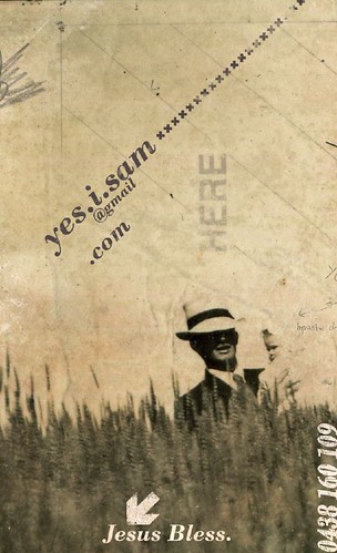
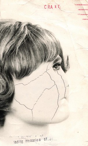
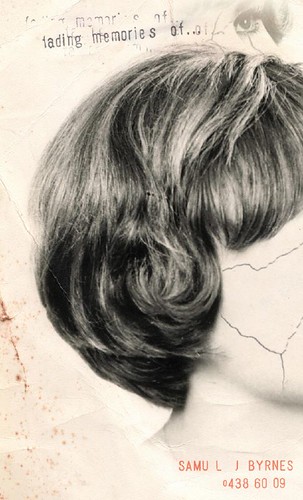
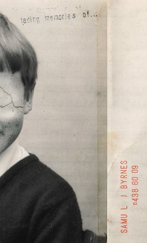
Xmas Greetings
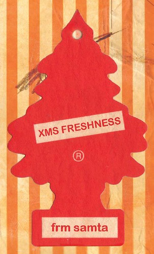
My first personal business card. I wanted to create a seasonal atmosphere. Killing two birds with one stone, I made the front into a Christmas card and the back into a business card.
posted by Samuel J at 11:30 pm
1 comments
![]()